City Pups Design Sprint
Connecting city residents with their future purrfect furry companion
City Pups Design Sprint enhances pet adoption for city residents who struggles to find the right pet for them because existing adoption websites lack crucial information. Utilizing available insights provided, I led a design sprint to ideate the MVP, create the prototype, and validate solutions through usability tests.
Work
- UI/UX Design
- Visual Design
- Responsive Web Design
Platforms
- Mobile
- Web
- Tablet
Tech Stack
- Figma
- Sketch
- Invision
- Adobe XD
- Adobe Illustrator
- POP! Marvel
- Qualtrics
- Miro

Finding the purrfect match
The City Pups project is a modified version of the Google Ventures Design Sprint project created to improve the pet adoption experience for future pet owners who live in an urban environment.
The constraint for this project is that the design must be for a website or a web app that focuses on helping users find the right pet for them. CityPups will redirect users to a third party to complete the adoption process.
Finding the purrfect match
City residents often have a hard time finding the perfect pet that they can properly care for. While many adoption websites are great at promoting adoptable pets, they are not the best at giving potential adopters the information they need to make an informed decision that will benefit the pet and align with their lifestyles.


The all-in-one platform where adoptors to connect and keep track of their applications with shelters
CityPups is designed to help potential adopters feel more confident in their decision by matching potential adopters with the perfect furry friend who checks all the boxes. To solve the communication problem, my solution for CityPups also provides a platform for users to communicate with shelters, inquire about the pets they are interested in adopting, and keep track of their communication.

Sprint Methods
With limited 1-week time frame, I built a 5-day sprint plan to come up with the quick solution that is still research-driven and helpful for future iterations.
Day 1: Map
- Research Synthesis
- User Journey Maps
Day 2: Sketch
- Competitor Analysis
- Crazy 8s
- Sketches
Day 3: Decide
- Storyboarding
- Low Fidelity Design
Day 4: Prototype
- Wireframes
- Visual Design
- High Fidelity Prototype
Day 5: Validation
- User Interviews
- Usability Tests
Understanding the problem and mapping the insights
The challenge jumped right in to finding key insights to ideate the solution.
User Painpoints
The major problems that users mentioned during interviews and usability tests include:
Inadequate information
Other than breed and size of the pet, the most important information for adopters is the pet’s personality and temperament.
Communication
Adopters have to contact representatives from adoption centers and shelters which is time consuming process. It's also hard to keep up with any updates
Confidence
With the lack of information available, people cannot make a decision with total confidence that the pet would be a great fit for them. This often ends with the adopted pet being returned to the shelter.
Highlights from the data
“I end up falling in love with a little dog that needs more space to live and play than I can offer"
Solution
Matching pets to the users' lifestyles
A web-based platform where adoptable pets can get matched with their potential owners who checks all the boxes.
Boosting engagement
To solve the communication problem, my solution for CityPups also provides a platform for users to communicate with shelters, inquire about the pets they are interested in adopting, and keep track of their communication.
Info bank
Users are provided with relevant articles that inform them about the breed, temperament, and ideal care for the pet so they can self-assess their situation.
Ideating with User Journey Maps
I iterated 3 different user journeys that map out the steps that users need to take to complete the adoption process.

Minimum Viable Product
With the user journey in mind, I was able to quickly finalize the MVP for the prototype:
Onboarding quiz
Users will be encouraged to fill out information about their lifestyle in order to see pets that are most suitable for them.
Browsing matches
Once the user receives their matches, they can browse the list of recommended pets that mostly matches their profile. Here, users can add any pet profiles to their favorites which they can easily revisit to when they return to the platform.
Communication channel
Any pet profiles that have been added to their favorites will automatically be added to the communication channel. Here, users can contact the shelter/adoption agencies directly to learn more about pets and set up an appointment to meet them.
Sketch
The goal of this stage is to explore and envision the user journey by analyzing competitors sites for inspiration and creating quick sketches using the Crazy 8s method. As a result, I sketched out 3 critical screens that I can build on.
Lightning Demos
I set out to find inspirations by analyzing some of the most popular websites that were created to solve a similar problem including Adopt a Pet, Pet Finder, and Hinge. The analysis helped me discover the heuristics of similar platforms and what features are most effective to help users find their match.
Adopt-A-Pet
A non-profit website that heavily focuses on images and information on adoption process.
Above and below the scroll

I found that the non-profit website focuses more on sharing images and showing the adoption process on the pet profile as both of these information are above the scroll. Below the scroll, the users can see the basic facts, information regarding vaccination status and compatibility with other pets and children, and more detailed description of the pet personality.
Key areas for improvement

This website can be immensely improved by reprioritizing the information available. It may be more helpful for users to see the basic facts above the scroll right by the pictures to make best use of the screen real estate. As the adoption process is similar for most pets, it can be moved lower on the page where users can scroll down to see when they are ready to take the next steps.
Pet Finder
A non-profit website that heavily focuses on images and information on adoption process.
Clean interface, short quiz, scannable

Pet Finder does a really great job at providing a clean user interface to help users easily navigate. This website offers a quiz that is used to gather information about the potential owner. The quiz was short and easy to fill out. The questions on the quiz are personal enough to help users filter through pets that would match the user's profile.
Key areas for improvement

However, I believe the quiz can be improved to be more engaging and more personalized by asking the users what their ideal pets look like.In terms of the user interface design, the website feels more cohesive and has a great information architecture where users can easily scan the page to find information needed.
Hinge
The dating app, Hinge, does a great job at collecting relevant data with a more extensive profiles. It also encourages users to start conversations with their matches. CityPups can be the place where adopters can chat directly with the shelters, start the adoption process, and meeting up with the pet.
more info = data-driven matches

Highly detailed profiles help form data-driven matches to generate the best recommendations on the feed.
help users make moves with their matches

Users are encouraged to start conversations with their matches. and keep track of their potential dates.
Crazy 8's
After learning the improvements I could make on comparable websites, I used the Crazy 8’s method to quickly iterate the different layouts for the quiz that would be most effective for the users and visualize the user journey on CityPups.

Key Screens
From the crazy 8’s, I picked out 3 critical screens for the MVPs that I defined earlier to sketch out in more detail. As the quiz I designed is more extensive, I decided to include a progress bar to guide users through the process.
For the search results page, I included more information about each pet instead of just using photos to help users compare while they are browsing.
Lastly, the pet profile page is designed to show the most important information above the scroll including photos, shelter information, description, fun facts, and a call to action.

Decide
Storyboard
As I’ve clearly defined the must have features for each MVP in the sketches of the CityPups’ critical screens, I set out to sketch the storyboard for the full user flows: onboarding, browsing, and managing matches.
On-boarding Key Paths
- The homepage lays out how the website works and offers users 2 options: taking the quiz or going straight to browsing pets.
- If the user chooses to take the quiz, they have to answer questions about the user’s living situation, lifestyle, and preferred pet traits.
- At the end of the quiz, the user can either save their profile by creating an account, or just continue as a guest.

Browsing
- On the search result page, users will see all the pets that match the user’s profile
- Users can browse the list and click on each pet to learn more.
- While the users are browsing, they can save the pet to their favorites, send a message, and share their profile with the adoption center.

Managing Matches
- Users can easily keep track of their contacts with adoption centers on the Messages Page
- Users can see their favorite matches that they saved and view the status of their communication with the adoption center on the Saved Matches Pages.

Prototype
Using Figma, I turned the storyboard into a high fidelity prototype. I chose the high contrast color combination and clearly defined typographic hierarchy so users can easily scan for information. On the other hand, I used colorful illustrations and images to provide a pop of color to the design and highlight the photographs of the pets.
Homepage
The homepage defines clear instructions for the users on how the website works. The call-to-action button prompts users to start their journey by taking the quiz.

Quiz
The four page quiz is equipped with the progress bar with a percentage marker to show the user how far along they are on the quiz.


Sign Up / Log In
The simple Sign Up page offers the option for users to continue their search as a guest before they commit to creating an account on City Pups.


Search Results
The search results page shows the basic information about each pet including their features, vaccination status, how they behave with other pets or children, and if they have been house trained.
On the pet profile page, users can learn more about the pet’s personality, browse articles about the breed from reputable third party sources, and directly contact the shelter.


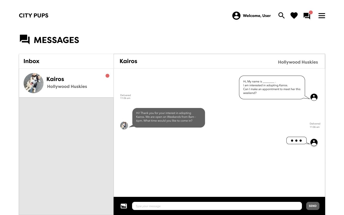
Messages
On the messages page, users can chat with the shelter to schedule an appointment and keep track of conversations with different shelters. Users can also check on the status of their favorite pets on their saved matches and navigate to the messages page from there.

Test
After completing the site, I conducted a 30-minute interview with five users about their experience with the pet adoption process. I also gathered some valuable feedback from the usability tests that helped me to refine the Sprint prototype.
Interview Findings
How they found their pets
4 out of 5 users did not find their pets through adoption websites but rather directly from the shelter, a Facebook page, on Craigslist, and through a friend on Snapchat. One user who found his dog on an adoption website said he liked the filters because he already knew what kind of dog he wanted
What are they looking for
Some users are looking for a therapy pet while the four other users wanted a companion. The most important factors in their decision are:
- living situation and outdoor space
- their schedule
- the pet’s exercise needs
- the pet’s personality,
- the cost of care, the pet’s mental and physical health
- location and transportation options
How they feel about adoption sites
Some users mentioned that they felt sad, overwhelmed, and disappointed when they visited pet adoption websites. Some user felt that adoption websites are unreliable and untrustworthy.
“I found a dog that I liked on this website but I was disappointed when I found that the dog was already adopted 3 months ago.”
- Claire
Usability Test Findings
Tasks
- Take the quiz
- Find the pets that they think would be the best match for them
- Reach out to adoption center to learn more about the pet that they’re interested in
Wording issues while completing the quiz
Users were confused when answering some of the quiz questions because of the wording. They felt like the drop down format for answer choices suggested they can only pick one answer. They also wanted an option to answer certain questions later.
“How many hours is a few hours exactly?”
“What does HOA mean?”
“Can I select more than 1 option if I want to adopt both medium and large sized dogs?”
Info bank
Users would like to see adoption fee for each pet. On the homepage, they mentioned that they did not know how to directly start browsing on the homepage. They also would like to be able to log in from there if they were a returning user.
What they loved
On a positive note, users mentioned that they like the % match for each pet on the search results page. They also love the messages page because they can come back here to see the responses instead of going through emails and phone calls. Users liked that it was easy to scan through information on each pet.
Final Prototype
I made changes to the design based on user feedback. On the homepage, Users can start browsing right away by using the Search Bar. Instead of getting stuck on the quiz, users can use the, "I'm not sure," option regarding the HOA/Lease Restrictions.
What I learned
Knocking down creative blocks and getting the ideas flowing
Completing this design sprint project helped me push past the creative block and ideate quickly without the pressure of being pixel perfect. At the end of the day, not all ideas are meant to be executed. Practicing the design sprint means there is little time to focus on the details but it could help me cut out bad ideas faster.
Collaborating on a design sprint with a team yield even better results
While working alone allows me more control of the project, it also means that I lack the perspective that collaboration could bring. I believe that using this methodology in an agile team environment will yield even better results. Involving product managers, engineers, marketers, and other designers in this early ideation stage would tremendously help me refine the solution especially as I move on to work with larger projects.