BlendED Courses
Mobile interactive syllabus that helps students keep up with coursework on the go
BlendEd Courses is a web-based platform where professors can design and update the syllabus so college students can stay up to date through the course. I led a team of 2 UX designers in building the mobile UI system and designing the high-fidelity prototype of the student view and collaborated on research, ideation, and usability tests.
Work
- UI/UX Design
- Visual Design
- Responsive Web Design
Platforms
- Mobile
- Web
- Tablet
Tech Stack
- Figma
- Sketch
- Invision
- Adobe XD
- Adobe Illustrator
- POP! Marvel
- Qualtrics
- Miro

Syllabus PDF files are not easily readable nor accessible on mobile devices
Students find lengthy syllabus stressful and overwhelming. When fitted on a small screen, the content is hard to read, browse, and interact with. Each week, students spend hours tracking their assignments, turning assignments into to-do lists, and manually adding exam dates into their personal calendar. Not only that, most of the syllabus contain information that many students only read once and never look at again.


An Assignment-Centric Interactive Syllabus
We helped BlendEd become the students’ go-to mobile platform by making the syllabus easy to browse, free of clutter, and accessible on all devices.

An engaging dashboard that prioritizes weekly assignments
Students can easily browse their weekly progress, upcoming assignments, and access instructions for each upcoming task in one click.
An organized page for each section of the syllabus
A separate info page includes sections that are often viewed once, such as course overview, required materials, and policies.
A responsive UI design system that passes WCAG guidelines for mobile web applications
We keep navigation simple with drop-down menus and labeled arrows so students can quickly jump between different weeks and sections. We refined the color palette and contrast levels to accommodate a comfortable read and highlight important elements with eye-catching colors.
Methodologies
Research
- User Interviews
- Competitor Analysis
- Affinity Mapping
Ideation
- User Journeys
- Sketches
- Rapid Prototyping
Design
- Wireframes
- Low Fidelity Prototypes
- High Fidelity Prototypes
Validation
- Moderated Usability Tests
- Guerilla Usability Tests
Learning about students
Although BlendED had already developed the professor platform, the company had yet to solidify the design for the student side. We set out to study the heuristics and successful features of similar platforms, and conduct user interviews to learn more about student needs.
Competitor Analysis
My teammate, Kayla Clippinger, analyzed BlendED’s key competitors’ platforms including Unicycle, Moodle, My Study Life, and Springboard. Here's what we found to be a common theme among the 4 applications.


Easy Navigation
All platforms have pages dedicated to each syllabus section. Users can easily navigate the syllabus using tabs at the bottom of the screen or hamburger menu icons.
Personalized Dashboard
Dashboards shows an overview of any relevant information for the week. Some platforms also have progress bars that helps students keep track of their progress in the course.
Task Organization
Each user has a secured account that they can add tasks to. This allows for a more personalized experience that helps students keep track of their assignments.
Calendar View
An interactive calendar view of the syllabus helps users look ahead at what to expect during the semester, especially major events such as mid-term and final exams.

User Research
As a current student, I decided to conduct user interviews with fellow students at Pepperdine to learn more about how they use the course syllabus. My teammate analyzed the data we gathered from both user interviews and competitive analysis. Using affinity mapping methods, he has discovered 6 key insights about the users.
1. First actions
- Find class materials needed
- Check for any upcoming assignments due before class
2. Planning
- Refer to the syllabi 1 once a week to schedule assignments and due dates in their personal calendars
- Use the syllabus to plan smaller tasks for group projects
3. Frustration
- scrolling through the long pdf on mobile frustrating
- It's a hassle to redownload syllabi when professor makes changes
4. Laptop access
- access syllabus on laptops
- it takes too many steps to find the syllabus on school platforms
- never use mobile devices to read the syllabus - they have to scroll in all directions and zoom in and out to navigate
5. Feeling overwhelmed
- Lengthy syllabus indicates how difficult the class is and professors' expectation from students
- Users feel overwhelmed when they see syllabus
6. Calendar view
- users want to look ahead on what to expect during the semester
- users want to plan for major events such as mid-term and final exams
How might we?
With insights, we were able to clearly define our problem statement:
“Students are overwhelmed by the syllabus content. They find it difficult to access the syllabus on the go because it’s difficult to read a pdf on mobile devices.”
We used How Might We? questions to reframe the problem and guide our ideation process.
- HMW let students organize their syllabus from different courses?
- HMW direct students to different sections of the syllabus?
- HMW help students plan their week?
- HMW display urgent information for a quick view of the syllabus?
Ideating with contraints
While our research shows there are more features we should implement to help students manage their week, we are faced with a constraint that the first launch of the student platform cannot include student accounts. After a conversation with the development team, we decided to prioritize solutions that do not require students to have an account on BlendED.
Minimum Viable Product
After reframing the problem using HMW statements, we decided on 2 MVP features for BlendED's first launch of the student view:
Planning their week
A dashboard that highlights urgent items, an overview of the course, and a weekly calendar of assignments.
Information display
Building focused pages that are easily findable so students can quickly locate the information they need and easily digest content without feeling overwhelmed.
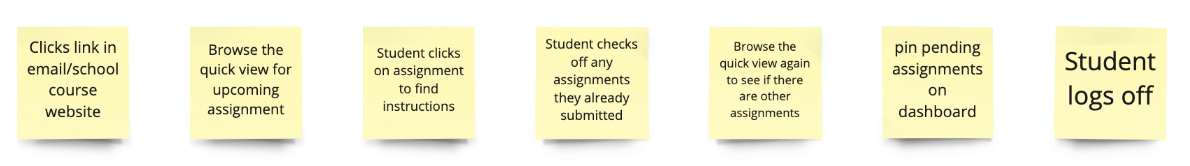
User Journey Maps
Due to the simple nature of the MVP and the limited time, we decided to use user journey mapping methods instead of user flows to help guide our sketches. The image shows our final user journey map that we decided to use.
Sketches and Early Usability Testing
To quickly iterate, each team member sketched their vision of the low-fidelity screens on pen and paper. We came together to share our work and pick out certain components that we think would work best for the MVPs.
My role in this stage is to converge our ideas into the final sketches and create a POP! Marvel prototype for guerilla usability testing.


Sketches
Homepage
- This page displays an overview of the student’s weekly course progress
- Users can see a list of assignments for that week and check off any tasks that they have completed
- Users can quickly gauge their progress bar to see how much they have accomplished for the week
Schedule Page
- Displays a weekly schedule of classes and assignments.
- Users can browse their schedule one week at a time using navigation arrows
Info
- Houses all the information regarding the class including course description, required materials, grading, policies, and more.
- Users can click through each section title to read more as they wish
Guerrilla Usability Tests
I used POP! Marvel to create the first prototype and conducted usability tests with 5 participants to uncover any issues and validate our MVPs. I recruit my classmates to test our first prototype by completing these following tasks:
Tasks
- Explore the class syllabus
- Find out where the classroom is and what materials you need.
- Look for assignments that are due soon

Findings
Confusing navigation indicators
- Users could not identify which class the syllabus is for
- Some users also mentioned that they want to browse through the course information page before diving into schedules and assignments when they first receive the syllabus.
View preferences
- Users wish to view all weeks in the course and skip to a section in fewer clicks
- User wants to be able to scroll through the entire schedule in reader mode
More personalization
- Users wanted to be able to get help and report any errors on the syllabus
- User wanted to customize her dashboard by adding or removing widgets on the homepage.
BlendED’s development team found that some of the ideas in our sketches could not be implemented. Some issues also require a solution where users needs an account on BlendED including the assignment submission, instructor notes, and “add to calendar” features. As a result, we further narrowed down our scope of features in the next phase where we digitized our prototype.
Refining our low fidelity design
Using the feedback gathered from the usability tests and development team, Akenaton and Kayla worked together to create the Wireframes with the proposed solutions for the critical issues. Take a look below to see the changes we made from Sketches to Wireframes.


Bringing the design to life
As we progress into the next phase, I lead the team through the high fidelity design stage. While Kayla was in charge of the content writing and co-designing, I took the lead in the visual design and the interactive prototype.
Mobile Components
To start off, I created the necessary components on Figma with variations to quickly flesh out the design using the company’s style guide.This allows me as well as any designers who will be iterating on this project in the future to make quick edits later on.

High Fidelity Screens
Using the components, I was able to quickly mock up all the screens needed for the prototype. As the focus is on functionality, I designed interaction in the most simplistic way to minimize delay in and complexity for a content-heavy mobile platform.


Usability Tests
I conducted the 2nd round of moderated usability tests with the high fidelity prototype with 5 participants and asked them to complete the same tasks. Akenaton synthesized the findings using affinity maps and prioritization charts.
Tasks
Imagine that you just received a link to a syllabus from your professors. You have yet to start your classes and you want to read through the syllabus to learn more about the course you’re enrolled in.
- How can you find where your classroom is?
- How can you find the course materials you need for the class?
- You’re in the first week of class, how can you check what assignments are due soon?
- How can you check what assignments are due in two weeks (week three)?

Findings
The critical issue in the user journey was that they had some trouble figuring out whether the assignments they checked off and the progress bar were related as no changes were shown when they checked off the item.
Another item that was unclear was regarding the critical assignments such as the final exam and the group project section, users wanted to see more emphasis on assignment items that carry more weight in the grading distribution on the schedule page.
Lastly, users mentioned that they were concerned about the security of the web app as they couldn’t create an account on the website.
Overall, we found that users were excited to test out the prototype and found the online course syllabus interactive, clean, and easy to read. However, we discovered key usability issues that can drastically improve the UI.
Figma Prototype
Our team incorporated the feedback and made final changes to the high-fidelity prototype, and presented it to BlendED.
What I learned
A research-driven process benefits every stakeholder
Although the research was not in our deliverable or part of the scope of the project, we were all glad that we did it because it has made a big impact in helping to guide our design and strengthen the foundation for this project. As UX designers, we have to advocate for our users so we can build a product that meets real users’ needs.
Communication is the key to successful collaboration
Working with a team of designers has taught me the value of being able to communicate your ideas well, not only verbally but also visually. I learned how to handle disagreements by sincerely listening to others’ ideas objectively and communicating honest feedback based on what I think would be best for the work that we are doing.
Next Steps
It has been a pleasure to work with BlendED on this project. I plan to keep in contact with the team and cannot wait to see our work come to life. I would love the opportunity to test the real product when BlendED launches the online syllabus platform.